Case Studies

The Robie House Interior Restoration Project Web Site

robie-case1

The Robie House Interior Restoration Project web site received the 2010 Webby for cultural institutions

Situation:
Architectural historians consider Frank Lloyd Wright’s Robie House one of the most important buildings in the history of American architecture. The building is being restored to its original splendor by the Frank Lloyd Wright Preservation Trust. The Preservation Trust wanted to create a web site that would meet the following objectives: 1) Build awareness of the Restoration Project 2) Immerse visitors in Wrights’ original vision for the Robie House interior and 3) Inspire people to make donations to the project.

Solution:
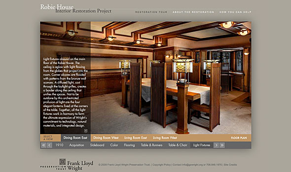
Zünpartners, a brand strategy and communications design firm, brought James Eaton Design onto the project team to collaborate on the site design strategy, interface design and web development. To accomplish the Preservation Trust’s goals, we designed an immersive tour of the Robie House that enables visitors to view the living room, dining room and the objects within.
To fully convey Wright’s vision, a ‘virtual restoration’ was performed on one of the rooms. This was done by photographing the room from the same camera angle and lighting conditions as the original historical photo, then digitally recreating the room’s original furniture and lighting. Visitors can see the process of restoration on the room from it’s condition upon acquisition to a final view showing the fully restored room in the evening. Wright’s lighting design for the room is something no one has seen for nearly 100 years.

Results
The site has been extremely well-received by the media and the preservation community. In 2010 the site won the Webby award for cultural institutions. The Webby Awards is the leading international award honoring excellence on the Internet, including websites, interactive advertising, online film and video, and mobile websites.

Site Credits
Bill Ferdinand, zünpartners, in partnership with James Eaton, James Eaton Design
Flash Development: David Bedingfield
Digital Imaging: Robert Frolich, Filtre Studio
Photography: James Caulfield, James Caulfield Photography
Art Direction: Bill Ferdinand, zünpartners

EL/Civics Online educational web site

elcivics-case1

The challenge: Translate real world educational expertise into an interactive, Web-based experience.

Adult Learning Resource Center (ALRC), based in the Chicago area, was contracted by the U.S. Department of Education to develop a series of online courses to prepare instructors of English as a Second Language (ESL) to integrate U.S. History and Civics content into their classes. ALRC had extensive experience in on site training, but needed guidance to translate their program into a compelling online experience.

We worked with ALRC from the early phases of the project to organize the content, establish the site’s information architecture and create a user-friendly interface. The site launched in 2007 and and has been continuously expanding since then.

  • EL/Civics Online contains more than 500 pages of content and features over 100 special interactive activities
  • Students are guided sequentially through the courses and the system keeps track of their progress. Students can also save notes and create their own lesson plans.
  • Since its launch in 2007, EL/Civics Online has had over 4,000 students register to take the courses

The ALRC had extensive educational professional development experience but was new to online training. Jim helped us organize our content so that it was clear, attractive, and formatted consistently. He suggested features and interactivity, and also listened and responded to our ideas and judgment. The online course has received high praise from both users & funders, and additional courses have been approved for development.”

~ Sue Barauski
Director, Adult Learning Resource Center

MTPV Corporation brand identity

mtpv-case

“Since the launch of the web we have had several unsolicited contacts from substantial and qualified prospects every week. It has turned out to be a great marketing tool.”

Situation:
MTPV Corporation has developed semiconductor chips that generate electricity from heat that promises to be more efficient than any thing on the market today. The company was seeking to engage with large scale investors to fund further development of the technology, Beta customers, and large industrial corporations to enter into strategic relationships.


Challenge:
Create a brand identity and present MTPV’s story in a manner that is easily comprehended and embraced by their target audience. Brand identity, imagery, and language all needed to work in concert to foster a deeper understanding of the company’s offering.

Solution:
MTPVs existing materials had grid and dots pattern that represented the company’s chip-based technology. We used the pattern and established a square grid that served as the basis for the MTPV brand mark. An environmental image was pixilated in alignment with the grid. The resulting brand identity conveyed MTPV’s environmental concern along with a sense of technical innovation.

Results:
“Our investors noticed the new site and were very pleased. Jim’s guidance provided to framework, a great image and a great balance between allowing the technical nature of the product to exist while speaking to a general business audience. We are able to tell a very complicated story clearly and concisely on the web. Since the launch of the web we have had several unsolicited contacts from substantial and qualified prospects every week. It has turned out to be a great marketing tool.”
~ David Mather
President and Chief Operating Officer, MTPV